Chapter 10. Competitive Reviews
![]()
A document comparing one or more web sites to a set of criteria or design principles to illustrate or validate those principles. Often used as an input into the design process.
A competitive review is a document that analyzes other web sites, extracting lessons learned to inform subsequent design activities. There are lots of reasons to perform a competitive review:
• Find out how other people solved the same design problems.
• Validate desired features and priorities against a similar site.
• Explore approaches to solving similar problems.
“Competitive” may be a misnomer. Sometimes you can look at sites outside the circle of competition to inspire new approaches for solving the same problems. Sometimes we call these comparative reviews.
One caution: A competitive analysis shouldn’t be the sole source of design inspiration. Don’t do something just because someone else is doing it.
What Makes a Good Competitive Review
Like any deliverable, a competitive review must be actionable; the lessons learned from looking at other sites must be immediately applicable to the design endeavor.
Focus
In the entire process of creating a competitive analysis, preparing the document is the easy part. You’ll have some tough decisions to make about the document—for example, whether to present a simple table or something more elaborate—but ultimately, this is not what makes the process challenging. Once you’ve established the criteria and the range of competitors, gathering the data is also fairly straightforward, albeit time-consuming. Drawing a box around your analysis, however, and establishing boundaries to define what’s relevant to your project, is the more difficult task.
This will be a lot easier if you identify your purpose before you begin your analysis. A purpose statement can drive not only the types of information you collect about each competitor, but also how you present the data. That purpose may be as simple as “We’re struggling with widget X in our site and we want to see how it is done on 20 prominent web sites.” Or, it may be as complex as “We’re building a system to support user group Y and we want to find out how this group has been supported elsewhere.” If you’ve decided to do a competitive analysis, spend some time with the team brainstorming about what you want to get out of it. Articulate a purpose statement and compare notes with the rest of the team to make sure they have the same understanding of the purpose. In the end, you’ll define an agenda for the research and set expectations about how the information will be useful on the project.
Regardless of how you organize your competitive analysis, with size comes a potential lack of focus. As you expand the reach of your analysis, either by adding more criteria or more competitors, you don’t want to lose sight of why you’re doing the analysis. Including a statement of purpose in the document itself is a great reminder, and also helps the document’s audience understand the context for the analysis.
Strong Competitive Framework
The competitive framework is the structure you use to tell the story, and what drives the moral of that story. A competitive framework is the technique for extracting conclusions—a set of criteria for judging sites deemed relevant—but it also gives you a way to tell the story.
Prior to looking at sites for comparison, make note of what conclusions would be most useful to the design team. Do they need:
• Direction on how to design a carousel?
• Inspiration on structuring a complex product catalog?
• Thoughts on labeling navigation items?
• Ideas for structuring page layouts for landing pages?
• Models for reconciling multiple levels of navigation?
• Sample flows for purchasing services?
The document should capture these questions: the inquiry that drives the study.
With these objectives in mind, you can derive criteria for evaluating the competition, for doing a more nuanced review. Criteria identify specific aspects of the design to explore. Consider these criteria for the objective, “How should we design a carousel that displays how-to videos?”:
• Size of video relative to entire component
• Mechanism for displaying range of videos available
• Mechanism for displaying overall topic of videos available
The design team might not care about other parts of the carousel, like whether users can navigate between videos linearly, or how big the video thumbnails are.
Criteria may not be necessary. You may just want to see how different sites accomplish the stated objective. Criteria, however, form a checklist that can help make your research more efficient and more focused. You don’t need them strictly to evaluate design ideas.
Ultimately, whether you rank the competition is up to you and your objectives. Stating that one approach is “best” may not be useful to the design team because it boxes them in: If it doesn’t look like site X, it’s just not good enough. On the other hand, ranking against individual criteria can give you a sense of which competitors provide appropriate inspiration for different aspects of the design. Your intent isn’t to create a Frankenstein’s monster carousel (just the thought of that…), but instead look at a range of inspiration and see how different sites accomplish the same thing.
Meaningful Comparisons
A competitive review against Apple or Amazon may yield some great lessons learned, but if these sites don’t overlap with your project, those lessons may not be very useful. Emulating big-name sites can only get you so far, especially if you’re not a computer manufacturer or a huge online retailer.
Balance conclusions from those sites with conclusions from sites more directly related to your work. Such an approach at the very least allows you to benchmark sites and see how they’ve used techniques from Amazon and Apple.
Tips for Presenting Competitive Reviews
Walking through a competitive review should always start with the lessons learned. How you elaborate on those lessons can take one of two forms. A competitor-driven story focuses each chapter on a different site, ideal for a small number of competitors. A moral-driven story dissects each conclusion and may draw from a range of competitors.
Option 1: Competitor-driven story
It may seem counterintuitive, but since the competitors will form the basic structure of the meeting, you should actually start with an account of the criteria. Provide an overview of the competitive framework at the top of the meeting to set the stage and then dig into each competitor more specifically. Describe how each competitor measured up in each aspect.
This approach works well for laying the landscape and for addressing broader issues, like how each site serves the needs of its target audience. By taking the stakeholders on a tour of the competition, you give them a sense of what they’re up against. This walking-tour approach helps answer broad strategic questions, such as which features are available on the site, what appears most prominently on the home page, and how the site prioritizes content, but not specific design issues, such as comparing the treatment of “add to cart” buttons.
Though a competitor-driven approach is best for discussing larger strategic issues, it can also work well for specific design problems. If you’re looking at just one aspect of the design, your meeting can show how the particular design problem was solved for each competitor. When discussing a specific design problem, your meeting can end with the conclusions, drawing together lessons learned from all the competitors.
Option 2: Moral-driven story
Instead of structuring your presentation in terms of the competitors and walking through all the issues for each competitor separately, this approach takes the opposite tack: For each issue, you talk about how each competitor stacks up against the others. To set the stage, provide a short overview of the competitors. You don’t need to get into comparing them at this point, but instead describe why they were included in the study.
The presentation then focuses on your conclusions. For each conclusion, you’ll first need to describe the criteria you looked at to arrive at the conclusion—in other words, what you analyzed on each site.
For example, you might conclude that the highest level navigation categories on a pet-related web site are usually pet type, but that this isn’t the only system of categorization used on the site. To support this conclusion, you looked at three different criteria: the navigation categories on the home page, the metadata attached to products in the catalog and other content, and the structure of intermediate “gallery” pages (galleries are lists of products or content that appear on the user’s path between the home page and the product or content page). Finally, within each of these criteria, you make observations about each of the competitors. This structure is useful for both high-level strategy analyses and specific design problems; the content of the conclusions may be different, but the logic behind them is essentially the same. In this approach, the criteria do not disappear, but they become a bridge between your conclusions and your observations.
Besides the structure of the meeting, however, you should also set the tone of the competitive review.
Maintain perspective
The worst way for a meeting to get off topic is to get too caught up in the competition. Although you’ve invited people to the meeting to discuss your site’s competitors, it can be easy to lose perspective on the purpose of the competitive analysis. Symptoms of this problem include getting stuck on one particular design element in a meeting about strategy, or spending too much time talking about one competitor over others. Even though your competitive analysis is meant to address one particular design problem, you might find conversation straying from that design problem into other areas of the site, or your participants might start talking about more strategic issues.
If the conversation is productive, you may not see this as a risk at all. However, if you have a specific agenda and certain goals for the meeting, these kinds of digressions may not be productive regardless of how interesting they are. To get back on track, jump in and remind the participants of the purpose of the meeting. One way to help stop this problem before it happens is to write the purpose of the meeting on a whiteboard or flipchart at the very beginning. If someone attempts to stray too far, you can always point to the meeting purpose and look very stern. You won’t be popular, but you’ll be respected for running a good meeting.
Know the rationale behind your methods
As you present the results of your competitive analysis, you may run into troublesome meeting participants who question your methodology. They may raise questions about your selection of competitors or criteria, or your technique for capturing data.
Say you’re building this pet web site, for example, and your analysis looked at a handful of sites. That might not stop one of your participants from saying, “I do all my online shopping at JeffersPet.com. Why isn’t that in your competitive analysis?” If you’ve done your homework, you can respond with, “Given the time constraints on the competitive analysis, we had to keep the number of sites down to four. We included DrsFosterSmith.com among our reviewed sites to represent the non-retail-store competitors, and think we’ve got a pretty good set of lessons learned. If, after our presentation, you think there are some aspects represented in JeffersPet.com that we missed, you can tell us about some lessons learned from there.”
Open your mind to varying interpretations
Meeting participants will have their own opinions about what works and what doesn’t work about different competitive sites. They may have their favorite sites and deem that approach the only one to follow. While discussion of the specifics of a site might be worthwhile, your role is to keep the conversation ultimately focused on the conclusions. Try not to sound like a jerk when you ask, but ultimately your focus is, “So what?” Since “Design our carousel to look like Amazon’s” is not an acceptable conclusion, you need to help meeting participants extract lessons learned not already covered by your competitive analysis.
Communicate your willingness to look at other competitors or consider other criteria, but emphasize that the purpose will be to provide direction to the design team. To facilitate this conversation, ask them to start with the existing conclusions and identify what’s missing. “What is it about Amazon’s carousel that you like that’s not reflected here?”
If any of their conclusions conflict with ones you’ve already established, and you’re not willing to throw away either one, perhaps this indicates that you need to seek design direction elsewhere. Sometimes multiple perspectives on a competitive analysis point to the method’s inability to provide a solid direction.
Anatomy of a Competitive Review
The essential elements of a competitive analysis are the purpose statement, conclusions, and evidence.
Organizing Competitive Reviews
Here’s a good table of contents for a competitive review:
By structuring the meat of the document around the conclusions, you can keep the endeavor focused and give designers one destination when dealing with a specific design problem.
The downside to this approach is that it can seem to take the sites out of context, providing only a narrow view of them.
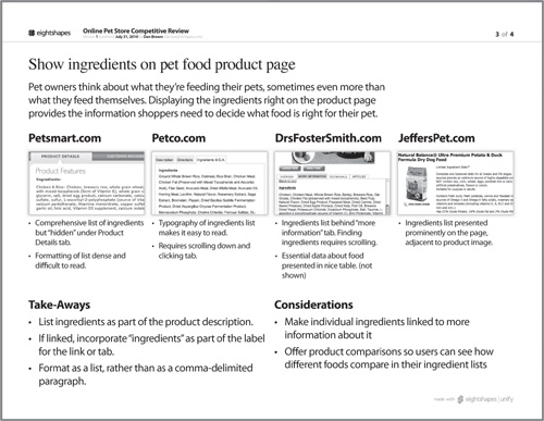
Figure 10.1. A conclusion summarized in a competitive analysis clearly states the lesson learned, offers some details about it, and provides evidence in the form of screenshots.
Another approach
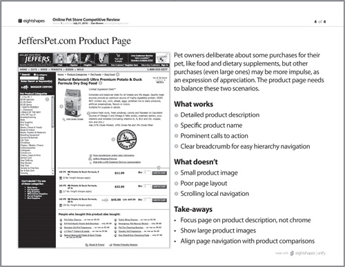
Another way to organize the document is by competitor. Each sheet deals with a different site, and draws conclusions from that site. In this case, the competitive analysis reads as a sort of rogues’ gallery of sites, each one having a separate profile. Within each profile, the site is described with various criteria. This approach offers a holistic view of the user experience for each site, but it is more difficult to compare between sites.
Figure 10.2. A competitor profile can speak more holistically about the site, but lessons learned become spread throughout the document.
Conclusions and Takeaways
Like any story part of the design process, you start at the end. What did you learn from looking at all these web sites? Did you get your questions answered? What should designers think about as they embark on this design project?
By putting your conclusions into words, you are establishing a partial direction for the design team, who will take their cues for the design from these assertions. The description of the competitive framework is meant only to support and illustrate the takeaways.
When embarking on building a pet-related site, for example, the design team may seek out best practices from the competition. A cursory study of the landscape allows them to conclude that most pet-related sites use pet type (dog, cat, and so on) as the main navigation. A more in-depth study, however, leads to more detailed data—how sites specializing in one kind of pet categorize their content, how frequently sites use the same categories, the order of the categories (cats first or dogs first), how sites deal with uncommon pets (turtles). With data like this, the conclusions—and therefore design direction—can be better informed.
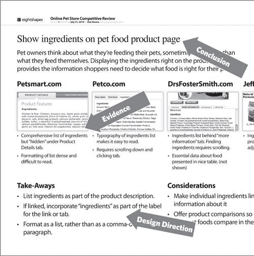
Assuming you’ve organized your document as in Table 10.1, you’ll have a separate page dedicated to each conclusion, illustrating that conclusion with screenshots of pages or components from various sites. Some considerations as you lay out those pages:
• Make the conclusion very prominent.
• Provide a more detailed description of the conclusion.
• Show just enough of the site to illustrate the conclusion, providing short descriptions explaining the connection.
• Consider incorporating an “anti-example,” a site that illustrates the wrong way to implement the conclusion.
Table 10.1. The competitive review should start with the lessons learned and then provide a detailed look at each conclusion. If necessary to spell out further detail, you can include a chapter of “raw data,” the competitive framework and profiles of the most important competitors.
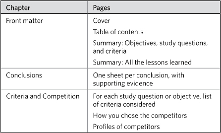
Figure 10.3. Conclusion pages must prominently show the takeaway and explain how the illustrations support it.
Summarizing the Conclusions
While designers will find detailed treatments of each conclusion and assertion useful, the document needs a summary at the beginning, a cheat sheet to boil down the lessons learned. The summary should capture the principles established through the competitive analysis and a snapshot of the competitive framework.
Note in Figure 10.4 that summarizing the competitive framework means identifying the range of sites examined and the criteria by which they were evaluated. The deeper and broader the analysis, the more you’ll need to abstract the framework. Looking at a broad range of sites along many criteria means barely scratching the surface of that depth on the summary page.
Figure 10.4. Summarizing the conclusions at the beginning of the document gives the project team a rundown of all the lessons learned from the competitive analysis.
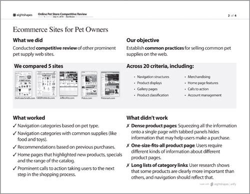
Characterize the range of sites visited by naming them explicitly; it’s even better if you can show a screenshot of the site itself. If you looked at many, many sites, be sure to quantify the range and identify the kinds of sites you looked at. For example:
• We looked at 20 different sites, all Fortune 500 companies.
• We looked at 35 different “Web 2.0” sites, all with a social or community aspect.
• We looked at two groups of a dozen sites each: product marketing sites and service marketing sites.
The criteria may be too numerous or too nebulous to spell out. Instead, characterize them through subject matter:
• We looked at how each site handled navigation and classification of content.
• We looked at how the sites adapted the experience in response to user preferences that were gleaned implicitly from the patterns of clicks.
• We looked at a range of user experience issues, from finding information to account management.
Incorporate comprehensive lists of both criteria and subjects (sites) into an appendix and reference them on the summary page.
Summarizing the Landscape
Even the simplest competitive analysis displays two critical dimensions: the competitive web sites and the criteria. Together these comprise the competitive framework. The purpose of the competitive framework is to present the data in a way that makes it easy to compare the various sites across the different criteria.
One simple way to display a comprehensive view of the competitive framework is to use a table; the competitors run along the top of the table and the criteria along the side. Tables 10.2 and 10.3 show two examples of this kind of competitive framework.
Table 10.2. Simple competitive reviews establish criteria and evaluate competitors relative to them. While useful inputs, this information doesn’t provide designers with clear direction on what’s working and what’s not.

Table 10.3. Positioning the criteria as questions allows readers to compare and contrast the two sites quickly, and hints at the desired approach.

A different kind of competitive framework is the two-by-two, plotting competitors on a simple grid depicting only two criteria as in Figure 10.5.
Figure 10.5. A comparative two-by-two establishes a simple framework for comparing a handful of web sites. Such an approach offers worthwhile insight if the criteria provide concrete action for the design team.
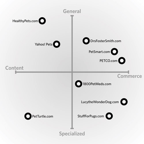
Notice that with a two-by-two, the number of criteria is shrunken down to two, so they tend to be broader. This type of graphic is useful for identifying holes in a landscape. Competitors clustered around certain areas of the two-by-two can indicate that there are opportunities for your site to fill those holes.
There’s one other kind of competitive framework that appears in comparisons of different user experiences: the small multiples. This term belongs to visualization guru Edward Tufte. In his Visual Display of Quantitative Information, Tufte writes: “Small multiples resemble the frames of a movie: a series of graphics, showing the same combination of variables, indexed by changes in another variable.” Small multiples, in other words, allow the viewer to easily compare similar sets of information. In the case of interface design for the web, this approach is most effective for comparing page layouts, as in Figure 10.6.
Figure 10.6. Small multiples of thumbnail layouts allow you to compare the structure of different pages across different sites. What might not be apparent from the grayscale is that different areas of the page have been highlighted with different color transparencies. Each color represents a different feature. This approach allows you to see how different sites treat different features, like navigation, sample products, product browsing, etc.

Types of comparisons
While most of my competitive analyses present subjective data, you can attempt to quantify the comparisons you make. The data can be as simple as yes-no values, indicating whether a site meets a particular criterion, or it can be descriptive, going into some detail for each criterion:
• Yes-No Values: You’ve seen these kinds of competitive analyses on infomercials where the product in question is lined up with “other leading brands.” For each feature, the product gets a checkmark while its competitors get an X, to show you how versatile the product is. When it comes to web sites, the straight yes-or-no comparison is most effective for considering features, in other words, whether a set of web sites has a specific feature or not. In such a comparison, however, the subtle differences between the competitors may be lost.
• Scores: Some competitive analyses score the competitors in different criteria. You’ll see this approach in restaurant reviews where every place is scored on the quality of its food, the ambiance, the service, and the expense. For web sites, scores help give a little more substance to the comparison, though it may be difficult to generate the data.
• Descriptions: Used more frequently than yes-no data or scores, descriptions specify how the competitors meet each criterion. Descriptions allow you to be more explicit about how the competitors stack up against each other, without resorting to potentially skewed numbers.
Methodology
Spelling out your process can help address any possible methodological inadequacies, especially for stakeholders who take these things seriously. What’s most worthwhile is rationalizing the selection of competitors and criteria.
The range of competitive web sites out there will vary, of course, depending on the site you’re building. The number may seem finite because your site is in a niche category and all the competitors are known players. The number may seem infinite because the web is vast and there are lots of sites competing for attention. You’ll have to narrow it down some way, and whatever way you choose makes for worthwhile content for your document.
At the same time, there are infinite criteria by which to compare sites. They can be as broad as the main navigation categories, or as narrow as the label on a button in a particular area of the site. You’ve made conscious decisions to include certain criteria—maybe they are a standard set used by your client or your company, maybe they were defined ahead of time by the stakeholders, or maybe you devised a special list just for this project. Whatever your methodology behind determining the criteria, this is excellent fodder for your competitive analysis.
Acknowledging the Competition
A competitive survey, no matter how rich the information gleaned from it, will always play second fiddle in the design process. After all, just because your competition does something doesn’t mean you should. The competition is a good place to get ideas and to establish a baseline, a cost of entry. But the value of that information in making design decisions is limited at best.
Innovation moves fast online. Regardless of how the design process evolves, information about how other sites address the problems you face will always be valuable, because it keeps you abreast of the latest trends in technological change. With innovation comes a change in landscape. At the most basic level, your audience has to make a choice, and it’s our job as designers to make that choice easy, even when we don’t understand all the factors that go into the decision.
When the commercial Internet emerged, retail stores faced a new kind of competition. Suddenly, competitors were lurking around every corner. This is still the case. What drives your understanding of the competition, therefore, should be a keen understanding of your audience. On the Internet, the competition is more than simply every other site trying to do the same thing you’re doing. The competition is nearly any site that can attract and hold a user’s attention. By knowing how your audience spends its time and how it makes decisions, you can anticipate how other sites or technologies are getting their attention, thereby expanding your survey of the competition.
